Directed Flex Layouts
If you've used a CSS framework like Groundwork, Base, or their many cousins, you've seen class declarations that specify how content is supposed to lay out. Most frameworks require you to specify the dimensions of each element—things like col-6, one third, or even grid-6. But what if you wanted to tell a container that, say, it should break its content into three rows, regardless of how many children it had? If you did that, instead of telling the elements how wide they should be, you'd let flexbox figure out the spacing.
Here's how it's going to work, once we're all done; just change the number of rows and watch as the layout changes in real time:
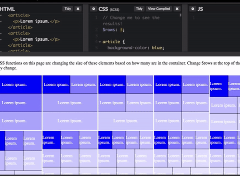
Check out the CodePen if you want to skip to the end, otherwise, let's get rolling!
Before we get started, we think it's important to recognize that we like to push Flexbox past its intended boundaries. Some day, we'll have the CSS Grid, which will obviate a lot of this work, but for now, we're having some fun.
Quantity Queries
First of all, none of this would be possible without the amazing CSS Quantity Queries work we first learned about from A List Apart. For this fix, we're using the SASS Quantity Query Mixin from Daniel Guillan.
Goals
Our end goal is to be able simply to place a class on a container that tells the container how to arrange its children. We'll aim for split-3 as the class for this tutorial, but our solution will support as many rows as you want.
To accomplish this, we need to know how many children a container has, and then decide how much space to give each. This is where quantity queries come in. But before we get there, let's get some basic CSS for our container element.
.container {
  display: flex;
  flex-wrap: wrap;
  overflow: auto;
  margin: 0;
  padding: 0;
}

article {
  margin: 0;
  padding: 0;
  flex-grow: 1;
}
There's nothing overly special here, just a simple container. To avoid some headaches with percentages, we'll need the articles to fill up space provided to them, which is why we set flex-grow: 1.
Groundwork (not the CSS framework)
The fun stuff starts when we build the quantity queries. Before we actually write CSS, let's establish what our goal looks like with our hypothetical split-3 element by thinking through how the children should be distributed, depending on quantity. The first three are easy:
| Number of Items | Arrangement |
|---|---|
| 1 | One Full-width |
| 2 | Two Full-width |
| 3 | Three Full-width |
But now we have to start making decisions. If we have four items, for example, how should we lay them out? In this case, we decided that in situations where the contents don't make even numbers of rows, we'd fill from the beginning, leaving remainders for the end. That means that our table would look like this:
| Number of Items | Arrangement |
|---|---|
| 1 | One Full-width |
| 2 | Two Full-width |
| 3 | Three Full-width |
| 4 | Two Halves, One Full |
| 5 | Four Halves, One Full |
| 6 | Six Full |
| 7 | Three Thirds, Four Halves |
| 8 | Six Thirds, Two Halves |
If you stare at the table long enough, you'll notice that it follows something of a pattern. If we call r the number of rows and n the number of children, here's the pattern:
| r:n | base width |
|---|---|
| n <= r | 100% |
| n <= 2r | 50%* |
| n <= 3r | 33%* |
And so on. This defines envelopes that we'll use in our SASS function. Speaking of which...
SASS
Let's get started, shall we? The first thing we're going to do is set up a cute little function that returns the percentage of 1 divided by a number. We'll use this later to figure out how much space the items should take.
// Return percentage of 1/n
@function _oneOver($i) {
    @return percentage(1 / $i);
}
Now for the real fun. We're going to build a function that takes the number of cells and assigns the correct width to them. Here's our first shot at the function, heavily commented:
// The maximum number of loops (complete sets of items,
// e.g. 6 items in a 3 split is 2 loops) we expect to have
// This is annoying but necessary because Ruby SASS
// (or maybe all compilers) doesn't allow a @for loop with @if and @else if
$max-loops: 5;

// The maximum number of children we expect
// We don't want to do this boundlessly, or we'd have a giant style sheet
$max-children: 12;

// Create a for loop, starting at 2
// (no point in declaring a value for one row, just don't flex-wrap that container)
@for $row_split from 2 through $max-loops {
  // We're going to create classes with names like .split-3
  .split-#{$row_split} {
    // For loop that will build the queries inside of each .split class

    @for $article_count from 1 through $max-children {
      article {
        // Now we start using quantity queries,
        // creating a class for each number of children
        @include exactly($article_count) {
          // Check on how the number of
          // articles compares to the number of rows
          // If we have fewer or equal to the number of rows
          @if $article_count <= ($row_split * 1) {
            // We get the percentage of the row ratio
            $percentage: _oneOver(1);
            // And assign it as the flex-basis
            flex-basis: $percentage;
          }

          // If we have between one and two times the number of rows
          @else if $article_count <= ($row_split * 2) {
            $percentage: _oneOver(2);
            flex-basis: $percentage;
          }

          // Etc.
          @else if $article_count <= ($row_split * 3) {
            $percentage: _oneOver(3);
            flex-basis: $percentage;
          }

          @else if $article_count <= ($row_split * 4) {
            $percentage: _oneOver(4);
            flex-basis: $percentage;
          }

          @else if $article_count <= ($row_split * 5) {
            $percentage: _oneOver(5);
            flex-basis: $percentage;
          }
        }
      }
    }
  }
}
Notice that we have to do the @if and @else if bits by hand. Unfortunately, Ruby SASS throws error if we try to do clever things with @for. Apparently @else if has to follow @if directly, with no intervening functions.
Here's an images of how this function comes out.
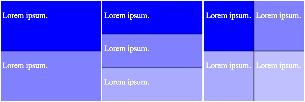
Notice a small problem? If we have four elements, they're 50% each, meaning we don't have a third row. That's probably fine in most cases, but for the purposes of this exercise, we said three rows and we mean it. Since this problem only occurs if we lack enough items to fill two rows, we can add our fix in the second if statement. Unfortunately, we're going to have to redo a fair amount of the work we did above.
Second SASS Attempt
We already talked about the behavior we want in the table above, so let's make it happen. The first thing we want to do is figure out what exactly it is we're looking at. Here's an excerpt from the table above:
| Number of Items | Arrangement |
|---|---|
| 4 | Two Halves, One Full |
| 5 | Four Halves, One Full |
As you can see, if we have one excess cell, we need two half-size ones, if we have two, we need four. Or, to put it another way, we need to control the size of r * 2 cells, where r is the remainder of cells/rows. In SASS, you get the remainder (mod) with the % operator. Here's a function that will get the job done, setting the elements to a base flex-basis and then overwriting with :nth-child():
$base_basis: _oneOver(2);
$mod: ($article_count % $row_split);

flex-basis: $base_basis;

@if $mod > 0 {
    @for $i from 1 through $mod * 2 {
        &:nth-child(#{$i}) {
            flex-basis: $percentage;
        }
    }
}
Unfortunately, this has several problems. First, if you have six items, they'll all be 100% wide—which makes sense, there's no remainder there. The second problem is that it fails if you have, say, seven items (since it's only resizing the first two, and now you need to resize the first three). To solve this in the idiom we set up above, we made a mixin:
// Make unequal row numbers fill in a reasonable manner
// Feed it the number of rows to split, the number of articles you have
// and the loop number (i.e. number of columns)
@mixin rowFill($row_split,$article_count,$loop) {
    // The size that we need the smaller elements to be
    $percentage: _oneOver($loop);
    // We need this later and Ruby SASS grumps at us if we don't have it
    $base_basis: 0;
    // The number of items we have in excess of the row count (i.e. of one per row)
    $dif: ($article_count - $row_split);
    // The remainder of article count / row count
    $mod: ($article_count % $row_split);

// This next section fixes the issue of having articles that
// are a multiple of the row count

    // We get the mod here to find out if we have a multiple of the row count
    // (If dif is smaller than row split, we still get !0)
    @if $dif % $row_split == 0 {
        // If so, we need all of the articles to be small
        $base_basis: _oneOver($loop);
    }

    @else {
        // If not, then we want the articles to have a larger base size
        $base_basis: _oneOver($loop - 1);
    }

    flex-basis: $base_basis;

    // Now we find out if we should be resizing a selective number of cells,
    // i.e. if there's a remainder
    @if $mod > 0 {
        // If so, iterate over every two children for each integer of the
        // remainder times the number of columns we expect
        // e.g. Five items in a split-3 would be mod: 2 and loop: 2
        // (we're on the second loop), meaning the first four items get resized
        @for $i from 1 through $mod * $loop {
            &:nth-child(#{$i}) {
                flex-basis: $percentage;
            }
        }
    }
}
Now let's add that back into our original @for loop:
@for $row_split from 2 through $max-loops {
  // We're going to create classes with names like .split-3
  .split-#{$row_split} {
    // For loop that will build the queries inside of each .split class

    @for $article_count from 1 through $max-children {
      article {
        // Now we start using quantity queries,
        // creating a class for each number of children
        @include exactly($article_count) {
          // Now we check on how the number of articles compares
          // to the number of rows
          // If we have fewer or equal to the number of rows
          @if $article_count <= ($row_split * 1) {
            // We get the percentage of the row ratio
            $percentage: _oneOver(1);
            // And assign it as the flex-basis
            flex-basis: $percentage;
          }

          // If we have between one and two times the number of rows
          @else if $article_count <= ($row_split * 2) {
            @include rowFill($row_split,$article_count,2);
          }

          // Etc.
          @else if $article_count <= ($row_split * 3) {
            @include rowFill($row_split,$article_count,3);
          }


          @else if $article_count <= ($row_split * 4) {
            @include rowFill($row_split,$article_count,4);
          }

          // You have to do these manually, which is annoying, sorry
          @else if $article_count <= ($row_split * 5) {
            @include rowFill($row_split,$article_count,5);
          }
        }
      }
    }
  }
}
And there you have it: this will work for any number of items and rows, as long as you change the settings variables. It's very versatile, though it's pretty file-size intensive to generate all of those classes. So...what about another option?
A Mixin!
If you don't expect to have to use this too much, how about a mixin you can just drop into a single element, rather than having to build a giant catchall class? And if you're using a mixin, you probably need some flexibility about what element you're resizing. Well, we've got you covered! Thanks for sticking with us—as a reminder, you can see a working version of this on CodePen, as well, where you can change the number of rows in real time:
The Mixin
// Remember that you need quantity queries and the rowFill mixin!
// $row_split is the number of rows you want
// $max_children is the maximum number of children you're going to have
// $element is an optional parameter
// if you don't fill it in, you just get every direct child of the parent
@mixin rowSplit($row_split,$max_children,$element:"& > *") {
    @for $article_count from 1 through $max-children {
        #{$element} {
            // Create a class for each number of children
            @include exactly($article_count) {
                //Check on how the number of articles compares to the number of rows
                // If we have fewer or equal to the number of rows
                @if $article_count <= ($row_split * 1) {
                    // We get the percentage of the row ratio
                    $percentage: _oneOver(1);
                    // And assign it as the flex-basis
                    flex-basis: $percentage;
                }

                // If we have between one and two times the number of rows
                @else if $article_count <= ($row_split * 2) {
                    @include rowFill($row_split,$article_count,2);
                }

                // Etc.
                @else if $article_count <= ($row_split * 3) {
                    @include rowFill($row_split,$article_count,3);
                }

                @else if $article_count <= ($row_split * 4) {
                    @include rowFill($row_split,$article_count,4);
                }

                @else if $article_count <= ($row_split * 5) {
                    @include rowFill($row_split,$article_count,5);
                }

                @else if $article_count <= ($row_split * 6) {
                    @include rowFill($row_split,$article_count,6);
                }

                @else if $article_count <= ($row_split * 7) {
                    @include rowFill($row_split,$article_count,7);
                }
            }
        }
    }
}