Fixing Flexbox’s Last Row with SASS
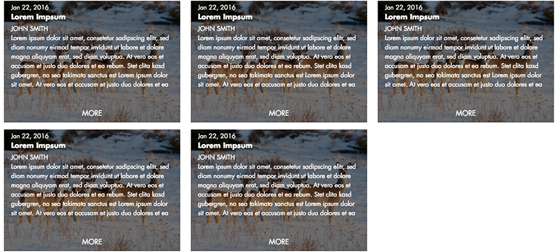
If you’ve been using Flexbox long enough, you’ll have seen something like this, where the last row of items is distributed oddly when using justify-content: space-between:
There are plenty of fixes that involve resizing the last item(s), but if you’re working with non-negotiable fixed-width items, you’re going to need something else. Here’s what I’ve come up with.
Quantity Queries
First of all, none of this would be possible without the amazing CSS Quantity Queries work we first learned about from A List Apart. For this fix, we're using the SASS Quantity Query Mixin from Daniel Guillan.
A quick note: this fix will only work if you know the exact width of your items. In this case, here’s what the items looked like:
.item {
  width: calc(33.3334% - 1rem);
  min-height: 275px;
}
Fixing the Problem
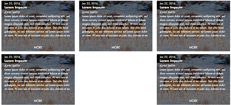
Our grid is three items wide, which means that we're going to have trouble any time there are two items on a line. When that happens, we need to move the last item to the left by the width of an item and the bit of space between them. In this case, that’s 33.3334% + .5rem. That’s easily enough accomplished by the following:
position: relative:
right: calc(33.3334% + .5rem);
Now we need to target this rule for only those items that break the formatting (2nd, 5th, 8th, etc.) Unfortunately, we couldn’t find a clean CSS rule for this, though it very well may exist.
This is where quantity queries come in! We can use the mixin to target exactly the 2nd, 5th, 8th, etc. items. We’d do it something like this:
.item {
  width: calc(33.3334% - 1rem);
  min-height: 275px;
  @include exactly(2) {
    &:last-child {
      position: relative:
      right: calc(33.3334% + .5rem);
    }
  }
}
Avoiding the Drudgery
And then include a rule for 5, 8, and so on. We’re going to get around the drudgery of that approach using a SASS @for function. In my case, I’m sure that I won’t ever have more than twelve rows.
.item {
  width: calc(33.3334% - 1rem);
  min-height: 275px;
  @for $i from 0 through 10 {
    // Get 2, 5, 8, etc.
    $exact_number: 2 + ($i * 3);
    @include exactly($exact_number) {
      &:last-child {
        position: relative:
        right: calc(33.3334% + .5rem);
      }
    }
  }
}
It’s not pretty, but it works!