How We Did It: clip-path
We use our "wav" design all over 2wav, from our business cards to our website. When we decided to launch a new site for 2015, it seemed like a natural fit to combine that wav with a new CSS feature called clip-path. Clip-path lets you define an area of an element that will be visible in the browser, hiding the rest. There are all sorts of great resources about clip-path that you should check out.
It's widely-supported, with only IE and Opera Mini missing out. Luckily, we're clipping a simple rectangle, so it will degrade just fine where it's not supported.
Getting Started
To make it work, you make some CSS that looks like this (courtesy of this clip-path generator):
.wav {
  -webkit-clip-path: polygon(200px 250px,406px 322px,300px 50px);
          clip-path: polygon(200px 250px,406px 322px,300px 50px);
}
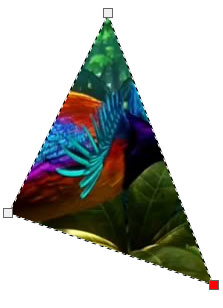
That'll give you a sort of curious-looking triangle, assuming you apply it to a large enough image. Unfortunately, the wave isn't a polygon, it uses a complex path. This meant that we had to use SVG notation instead. That meant we needed to get a bit more complicated and link to an SVG, like this:
.wav {
  -webkit-clip-path: url(#wave);
          clip-path: url(#wave);
}
Now we just needed an SVG to point to, with a clip-path that we call #wave. It would be nice to link to an external file, but browsers don't yet support that, so our SVG had to be in our HTML file.
Using a Custom Shape
We have our wave in SVG all over the site. Since SVG files are just simple markup, it should have been easy enough to turn one of them into a clip path, right? Here's an example of the markup for the back of one of our people cards, direct from Illustrator:
<svg x="0px" y="0px"
   width="220.014px" height="380.381px" viewBox="0 -175.381 220.014 380.381" enable-background="new 0 -175.381 220.014 380.381"
   xml:space="preserve">
<path fill="#FCB216" d="M0,205h220.014v-367.183c0,0-33.49-13.198-71.383-13.198c-41.313,0-84.828,28.607-148.631,13.198"/>
</svg>
Okay, we take it back. That's not really simple at all. To understand what all those letters mean, check out this exhaustive SVG path primer. We ended up being confronted by a lot of problems in converting the path. We're going to elide most of them in the interest of brevity, with the exception of units. The path above describes a discrete shape in pixels. However, we needed one clip-path that worked for every element, regardless of its size.
Luckily, we have access to the clipPathUnits declaration. When set to "objectBoundingBox," it lets us describe the path in relative units. We just needed to convert the path from absolute units to relative units. To do this, we ended up making a 100px by 100px version of the file and dividing each declaration by 100. It wasn't quite right the first time we tried, thanks to the aforementioned–path declarations, but we eventually arrived at this:
<svg>
  <defs>
    <clipPath id="wave" clipPathUnits="objectBoundingBox">
      <path fill="#FBB217" d="M.682,.055c-.225-.001-.337-.09-.682-.04 V1 H1 V.17v-.058v0
  V.089V.015C.905,.037,.783,.055,.682,.055z"/>
    </clipPath>
  </defs>
</svg>
Making it Work
And just like that, we have a working wave, right? Wrong. This is where the fun started. We originally built our page with a clipped fixed position element called .wav and some absolutely position elements that we moved around inside of it. Here's what the wave looked like:
.wav {
  -webkit-clip-path: url(#wave);
          clip-path: url(#wave);
  overflow: hidden;
  height: 95vh;
  width: 100vw;
  position: fixed;
}
[We use viewport units because it's annoying to make a tree of elements with explicit width/height.]
For lack of a better term, it exploded, with portions of the background appearing inverted (inverted!) in the clipped areas. So that was weird. Even weirder? It didn't happen on everyone's computers. This seemed like a pretty serious disappointment, but we're programmers, so we weren't about to let some weird bug get in the way of something cool!
From poking at it, we managed to figure it out: in Google Chrome on OSX with certain ATI graphic cards, if an element with a clip-path touches a position: fixed element, the clip-path breaks, often in unpredictable ways. Out of desperation more so than thinking would actually work, we just put the clipped element inside a container we called .wav_holder and styled them like this:
.wav_holder {
  height: 99vh;
  width: 100vw;
  margin: auto;
  position: fixed;
  overflow: hidden;
}

.wav {
  -webkit-clip-path: url(#wave);
          clip-path: url(#wave);
  overflow: hidden;
  height: 100%;
  width: 100%;
  position: absolute;
  top: 0;
}
Firefox Quirks
Miraculously, it worked like a charm! Or at least, it did Chrome and Safari. In Firefox, we didn't see our clip path at all. This was unexpected, since Firefox is supposed to support clip-path. Okay, time for more research. It was this very helpful article by Sara Soueidan that ended up on unlocking it for us [as a side note: we consider Sara to be required reading]. For whatever reason, even though Firefox supports the URL syntax and only the URL syntax, it doesn't work when referenced by an external style sheet. Once we added the actual SVG to the page and added this bit of code to our <head>, we were fine:
<style type="text/css">
  .wav {
    clip-path: url(#wave);
  }
</style>
And so, finally, we end up with a working clip-path! Of course, this was just the beginning. You see, while moving elements around under a clip path works great with top and its ilk, those properties are massive performance hosers.
Safari Quirks, too?
Instead, we use transform for our animations. Unfortunately, Safari had some trouble with this effect. For reasons that escape us but are certainly explainable by someone—using transform seems to confuse clip-paths made with clipPathUnits="objectBoundingBox". Rather than maintaining its shape, the wav tended to deform while things were moving and then snap back correctly.
We're going to be honest here, fixing this was mostly a game of guesswork. Our early research suggested that adding backface-visibility: hidden; and transform-style: preserve3d tended to fix Safari's misbehavior, so we set out applying them to every element on the page until we got it working. In the end, the key seemed to be the cards in our people section that were causing the issue—even when they were set to display: none, they needed backface-visibility: hidden;. Weird? Weird.