Responsive Tables
Update: we've now posted a version of this implementation that doesn't require CSS variables.
Yo I've been a web developer since 2008 and I still can't style a table to be flexible and responsive
— Brian Walters 🤜💥🐸 (@BDubCodes) March 31, 2017
As web designers, we've gotten used to a basic responsive design pattern where we collapse multiple columns down as we shrink the width of the viewport:

Of course, this poses a real challenge with tables. Because each column in the table has data about the specific item, there isn't a good way to start stacking columns. Instead most implementations just shrink the cells, which gets pretty ugly if you have a lot of columns.
Brian's tweet got us thinking about this problem. We decided on a few goals:
- Stay readable at any width
- Make it easy to compare cells' values
- Don't make creating the table any more difficult
- Don't re-draw the table in Javascript (i.e. change layout only in CSS)
Here's what we came up with.
Markup
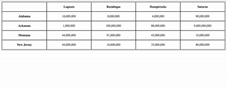
Let's start with the HTML for the table. As you can see, the markup looks like you'd expect for a table. We said we wanted to make the experience seem as normal as possible, and we meant it.
<table>
  <tr>
    <th></th>
    <th>Lugnuts</th>
    <th>Rutabegas</th>
    <th>Dumptrucks</th>
    <th>Saturns</th>
  </div>
  <tr>
    <th>
      <p>Alabama</p>
    </th>
    <td>
      16,000,000
    </td>
    <td>
      8,000,000
    </td>
    <td>
      4,000,000
    </td>
    <td>
      90,000,000
    </div>
  </tr>
  <tr>
    <th>
      <p>Arkansas</p>
    </th>
    <td>
      1,000,000
    </td>
    <td>
      100,000,000
    </td>
    <td>
      88,000,000
    </td>
    <td>
      9,000,000,000
    </div>
  </tr>
  <tr>
    <th>
      <p>Montana</p>
    </th>
    <td>
      44,000,000
    </td>
    <td>
      91,000,000
    </td>
    <td>
      43,000,000
    </td>
    <td>
      10,000,000
    </div>
  </tr>
  <tr>
    <th>
      <p>New Jersey</p>
    </th>
    <td>
      44,000,000
    </td>
    <td>
      16,000,000
    </td>
    <td>
      33,000,000
    </td>
    <td>
      80,000,000
    </div>
  </tr>
</table>
SCSS
We saved the complexity for the CSS. As is frequently the case, we thank Daniel Guillan for the amazing CSS Quantity Queries SASS mixins. This demonstration also uses CSS variables. Those aren't quite ready for primetime, though you could easily make a fallback for browsers that don't support them.
Default Styling
$max_columns: 10;

* {
  box-sizing: border-box;
}

table {
  width: 100%;
  border: solid black 1px;
  border-collapse: collapse;
}

tr {
  width: 100%;
  display: block;
  clear: both;
}

tr > * {
  float: left;
  width: calc(100% / var(--column-count));
  height: 50px;
  display: flex;
  flex-wrap: wrap;
  justify-content: center;
  align-items: center;
  position: relative;
  border: solid black 1px;
  @for $i from 1 to $max_columns {
    @include exactly($i) {
      --column-count: $i;
      @if ($i%2!=0) {
        --odd-adjuster: 1;
      }
    }
  }
}

th {
  font-weight: bold;
  cursor: auto;
}
There are a couple things of interest here. The first is the use of the --column-count CSS variable. We use this to track how many columns we have, and then set the width of each column accordingly. On desktops, that width is calc(100% / var(--column-count)), simply 100% split evenly across the columns.
Calculating the number of columns is the second item of interest, and is where Quantity Queries comes in:
@for $i from 1 to $max_columns {
  @include exactly($i) {
    --column-count: $i;
    @if ($i%2!=0) {
      --odd-adjuster: 1;
    }
  }
}
The first part of this @for loop checks the number of columns and sets the --column-count to that number. The second part checks if the number is odd, which will be important when we talk about mobile devices.
Mobile Styling
On mobile devices, we subvert the table markup, turning it into a flex container and hiding the top row. Then we resize the cells, collapsing the single rows onto multiple lines, but keeping the first cell twice the size of the others, so it still serves as a label.
@media screen and (max-width: 720px) {
  table {
    display: flex;
    flex-wrap: wrap;
  }
  tr:first-child{
    display: none;
  }
  tr:not(:first-child) {
    > * {
      width: calc(100% / calc( 1 + calc(calc(var(--column-count) - var(--odd-adjuster, 0)) / 2)));
      height: 50px;
      &:nth-child(1) {
        height: 100px;
      }
    }
  }
}
Most of this should make sense, but that width statement is a doozy, thanks to all the nested parentheses. Here's a hopefully more readable version:
calc(100% / /* The full width divided by*/
  calc( 1 + /* One plus */
    calc(
      calc(var(--column-count)  - var(--odd-adjuster, 0) /* The number of columns minus the -odd-adjuster property, or 0 if there isn't one */
        )
    / 2) /* Divided by two */
  )
)
For example, if there were five columns, this would set the width to 33%, but six columns would be 25%.
All of that done, we've got a table that collapses!
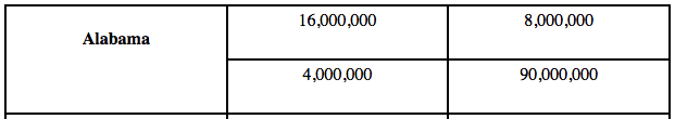
Unfortunately, it really lacks for readability. To fix that, we'd like to do some labeling when we collapse the cells (and some work past that, for bonus points).
Javascript
Since we said we wouldn't make creating the table any more complicated that creating a normal table, we're not allowed to put hidden labels within the table. Instead, we'll use Javascript to create and insert them.
$(document).ready(function(){
 // We want this to work for every table on the page
  $('table').each(function(){
    const table = $(this);
    // Get all of the table headings
    const topCells = table.find('tr:first-child th');
    // Get the bottom rows
    const bottomRows = table.find('tr:not(:first-child)');
    // We need to insert a label in each cell of a column, so we start from the heading
    topCells.each(function(index){
      // We don't care about the top-left cell—it doesn't label the cells beneath it
      if (index != 0) {
        const headerCell = $(this)
        const headerIndex = index;
        // Get the item name from the cell
        const itemName = headerCell.text();
        // Set the cell's data-item to the item name (useful later)
        $(this).data('item', itemName);
        // Now we need to label the appropriate cell on each line
        bottomRows.each(function(index){
          // Find the right cell (the index is one lower because of the <th> at the start)
          const cell = $($(this).find('td')[headerIndex - 1]);
          // Set that cell's data-item to the same item name
          cell.data('item', itemName);
          // Create an HTML element with the item name
          const itemEntry = `<p class="item">${itemName}</p>`
          // Append it to the cell (we hide it with CSS)
          cell.append(itemEntry);
        });
      }
    })
});
With the addition of a bit of CSS, we now have labels for each value that appear when we collapse the table:
Bonus Points
This all works really well, but it does lose the ability to easily compare values by reading straight down a column. We're going to do two things to make it easier to compare values, both based on clicking a cell: put the value in the row header, and highlight each row's entry for that item.
To do that, we're going to add a bit of code to the Javascript we had above:
// Find the heading of each row
const rowHeads = bottomRows.find('th');
// Add an empty <p> that we'll populate later
rowHeads.each(function(){
  $(this).append('<p class="value"></p>');
});
Next we're going to add some code that will get each row's value for that item and insert it in the first cell of that row, plus apply the selected class.
$('td').click(function(){
  // Unselect everything
  $('td').removeClass('selected');
  // Select this cell
  $(this).addClass('selected');
  // Find the item this cell represents
  const itemName = $(this).data('item');
  // Find the cell's parent table
  const table = $(this).closest('table');
  // Find that table's bottom rows
  const bottomRows = table.find('tr:not(:first-child)');
  bottomRows.each(function(){
    const row = $(this);
    // Find all the cells in the row
    const itemCells = row.find('td');
    itemCells.each(function(){
      // Find the cell in question's item
      const thisItem = $(this).data('item');
      // If it's the same as the item we clicked
      if (thisItem == itemName) {
        // Select it
        $(this).addClass('selected');
        // Set the row's value label to that amount
        const thisValue = $(this).text();
        row.find('.value').text(thisValue);
      }
    });
  });
});
We need to support all of that with some CSS, as well.
tr > * {
  p {
    width: 100%;
    display: flex;
    justify-content: center;
    margin: 0;
    &.value {
      display: none;
    }
    &.item {
      display: none;
    }
  }
}

@media screen and (max-width: 720px) {
  tr:not(:first-child) {
  > * {
    p {
      &.item, &.value {
        display: flex;
        justify-content: center;
      }
    }
  }
  td {
    &:hover {
      cursor: pointer;
      background: rgb(115,115,115);
      color: white;
    }
    &.selected {
      background: rgb(175, 175, 175);
      color: white;
      cursor: auto;
      &:hover {
        background: rgb(175, 175, 175);
        cursor: auto;
      }
    }
  }
}
Wrap Up
As a reminder, here's were our goals for this exercise:
- Stay readable at any width
- Make it easy to compare cells' values
- Don't make creating the table any more difficult
- Don't re-draw the table in Javascript (i.e. change layout only in CSS)
It took some serious work, but we're happy with the result. It's not quite ready for production without a fallback for CSS variables, but that wouldn't be too much work to do. If you want to use it now, here's a version of this implementation that doesn't require CSS variables. Thanks for sticking with us. Check out CodePen for the full implementation, and please let us know if you have any suggestions for improvements!